ShopDreamUp AI ArtDreamUp
Deviation Actions
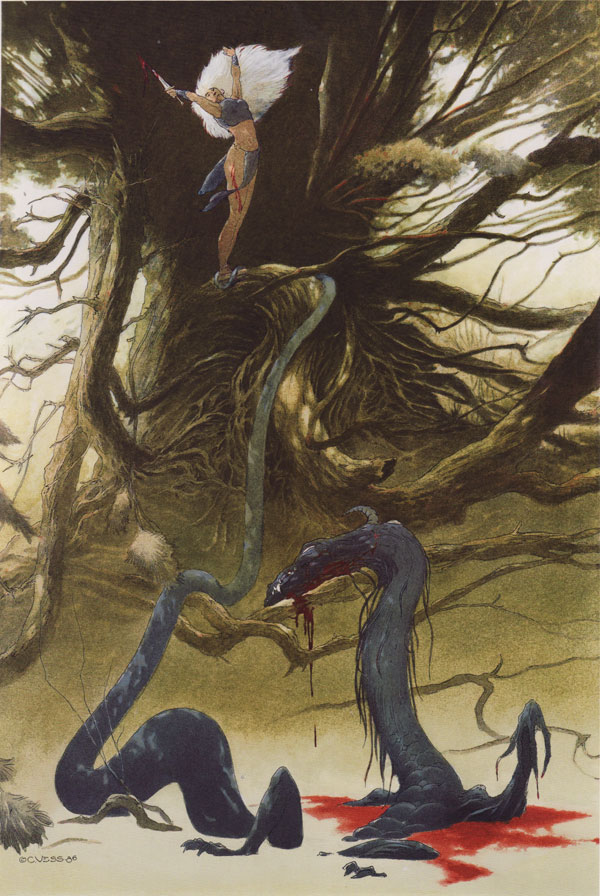
The White Goddess, by Charles Vess, both versions copyright 1986.
In Drawing Down the Moon: The Art of Charles Vess.
This analysis copyright Scott M. McDaniel, 2010.
The Images
There are two versions of The White Goddess. This one is colored inks.
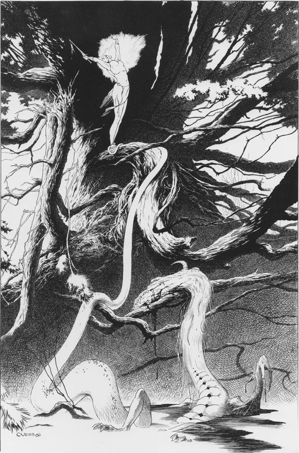
And this one is pen and ink:
So I'm finally back after the hiatus. I've been antsy about the time off, so I'm glad to get to this one. I first ran into Charles Vess' work in the Sandman comics and his association with Neil Gaiman (Stardust, The Blueberry Girl, etc.). I find it easy to pick out his art based on style alone, and I also think it draws heavily on golden age illustrators like Rackham and Dulac. (I just picked up a good book on Dulac, so I'll be doing one of his soon).
Vess' book Drawing Down the Moon is a great overview of his work. (Great production values too - the chapter division pages are really cool.) I picked The White Goddess because it's a rare opportunity to see two finished versions of the same piece - one in color and one in black and white. What decisions does Vess make differently based on the choice of medium? We'll look at several examples, plus we'll check out the overall composition.
The Overlay
The first thing I did was scan both pieces and then overlay them to get an idea of where the similarity and differences are. Here is a graphic that switches back and forth between the two versions. See what you notice, and then continue on below to look at a few image details in the same way.
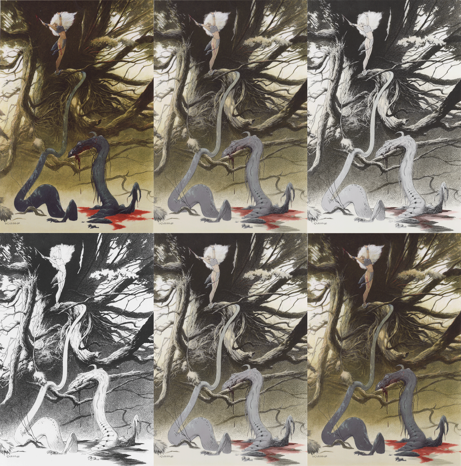
The first thing to notice is that the black and white version isn't just a monochrome version of the color image. To show this a little better I took the color version and converted it to greyscale. Then I posterized it down to four values. Here it is next to the pen and ink version.
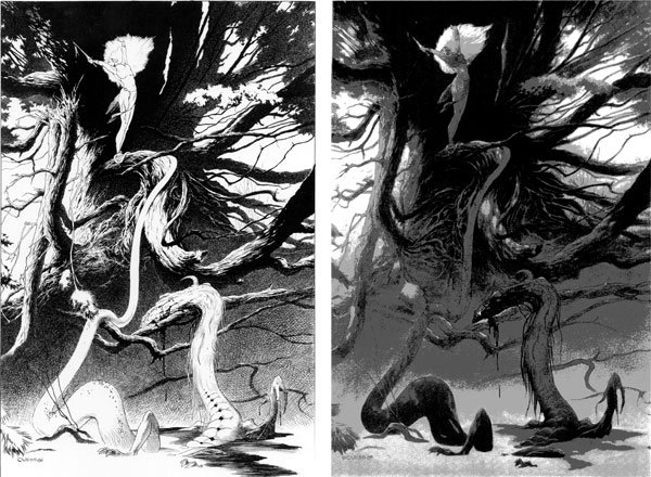
Look, for example, at the dragon's body in the lower left part of the picture. In the pen and ink version on the left, the body is white against the dark background. In the version on the right, though, which came from the color, the dragon's body is darker than the background. Why?
When you're not working with color, contrast is the main tool available to define forms and edges. With color, though, not only do you have values in the toolbox, you've also got hue. In the color version the dark dragon's body is blue. Even though the value is pretty close to the background's, the fact that the background is a warm yellow/brown gives our eyes another difference to latch onto.
The Detail Images
First up let's look at the dragon's head. I find the black and white version easier to read. I didn't realize that its head is rolled away from us until I looked at the black and white version. The color version doesn't work for me quite as well in that regard.
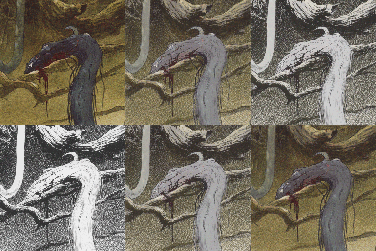
On the other hand, I think the red of the blood dripping from the dragon's head comes through better in the color version. Here are some other differences I see.
Now let's look over at the left side of the image where the light strikes several branches and root structures.
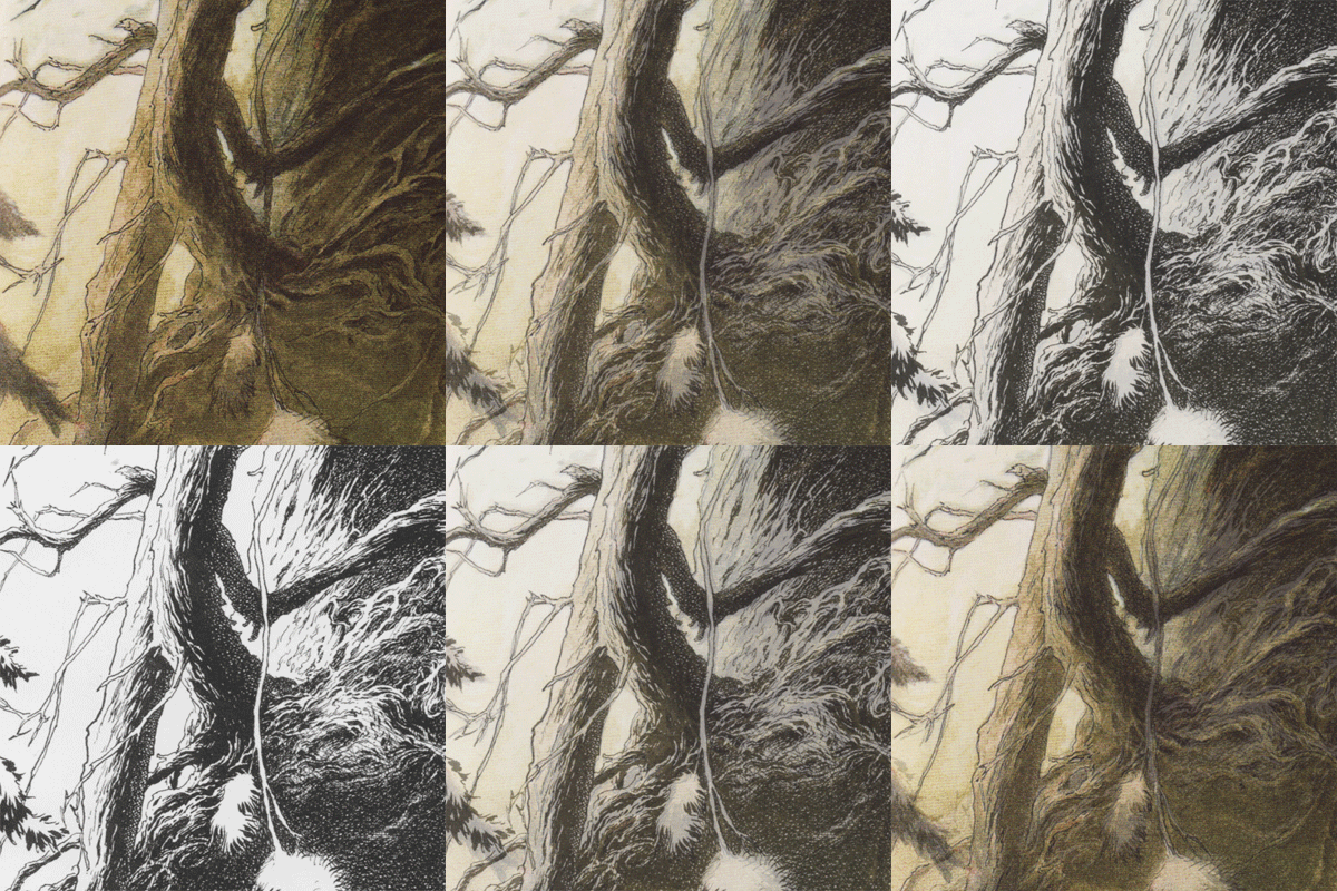
Look carefully at the contour lines. The little breaks and twists in the twigs are just a little bit different. I suspect that Vess started from the same drawing for each of these but then executed them separately in each medium. Like the dragon head, we see Vess dropping out much of the texture lines but keeping the contour lines. Which version do you think gives you a better sense of form and depth? For me it's the B&W version - it's easier to see which branches pass in front of or behind each other (occlusion). The hatching on the main branch also suggests reflected light from right side where the main tree trunk is. It's there in the color version too, but there it's more subtle. Other notes:
Finally, let's look at the white queen herself.
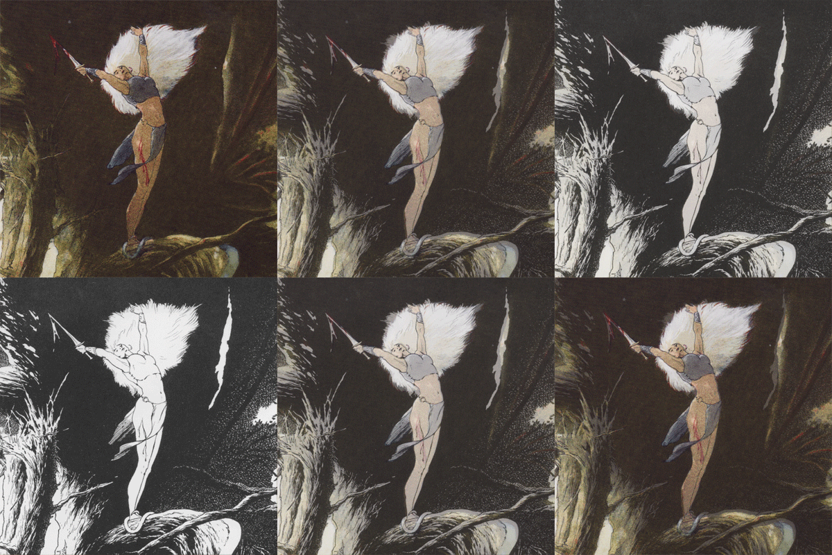
She's our focal point, so I'd expect high contrast here and, in the color version, high saturation as well. The B&W version darkens the area behind her completely and makes her almost completely white. She really does stand out with all that contrast. There are a few spare lines inside the figure that show where she's bleeding and outline the loincloth, which is also white. In the color version, the figure's value is a lot closer to that of the background, and the loincloth is also a dark blue. That works against the warm color of her skin. Look at how the wound and the blood pops out so much more because of the saturation. It's also taking a slightly different course down her leg. The important thing in the B&W version is the contrast - we need to see it. The color version has saturation to play with, so it's OK if the line of the blood forms a tangent with the leg and wraps around it. A few other notes:
The Composition
Here's the color version with the golden section grid overlaid. Whether by intuition or intention, several elements line up very well with it. The queen herself is on the left section line, and the dragon's head and neck are at the intersection of the right line and the lower line. The dragon's body in the lower left rectangle points right up to another intersection.
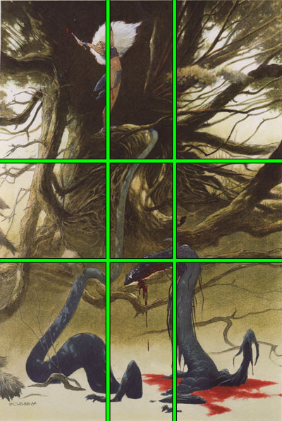
Here's a graphic showing some of the major edges in the picture. The left side in particular is a good example of what James Gurney calls "spokewheeling." That is, the branches point us right to the picture's focal point.
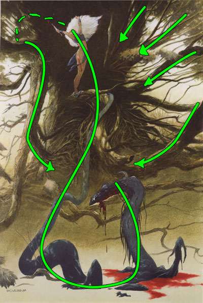
The other thing I wanted to point out was the vertical figure eight curves in the picture. The dragon's body forms its lower part, and the figure and left bough form the upper part. There are plenty of other loops and paths for our eyes to follow, but this is the key one for the picture.
The Elements
To wrap up we'll go through Lee Moyer's Elements of a Successful Illustration.
Focus: The White Queen is the focus of the picture, with the dragon being a strong secondary focus.
Composition and Design: There is a diagonal relationship between the two foci, and a figure eight loop takes us back and forth between them. Branch patterns also suggest paths to our eyes and bring our gaze back to the foci.
Palette: Muted warm colors for the most part. The few small bits of saturation are at the foci. The cool colors are the dragon and the queen's clothing. Both choices reinforce those objects as foci.
Value: Vess gets a more complete value range in the B&W version through hatching and some textures. He still uses value in the color version, of course, but he shifts the emphasis over to color and texture as well.
Mass: I get a better sense of mass in the B&W version.
Texture: Likewise I prefer the texture in the B&W version. This is personal taste, because it's certainly there in the color version too.
Symbolism: I'm not familiar with the original context. To read in a couple of things that may or may not be intended, I could see a Biblical theme in which Eve finally defeats the serpent (though not unscathed), and there's also the possibility of feminist themes. In this case the dragon would be phallic (though not sexual) and the woman has defeated it.
Micro/Macro: I like how Vess uses detail and texture on the branches and roots of the tree but leaves much of the dragon's body as simple silhouette. It both gives us a lot of fun stuff to look at in the trees, but it also drops it back and gives it a mid-tone value. The silhouette gives us the contrast.
Ornament: Take a gander at the pattern on the dragon's back in the B&W version. It's gone in the color. Yeah, I just said "gander." What?
Narrative: Like a lot of good illustration, this picture doesn't show the heat of the action. Instead, it shows us its immediate aftermath and lets us fill in the details.
Juxtaposition: The size difference between the woman and the dragon is effective both as storytelling and visually in the image.
Stylization: Part of Vess' style is a love of trees and branches and plants. Compare this picture with Ian Miller's THD.
Character: This isn't a subtle posture. That, plus her clothing and bloody dagger tell us she's pretty bad ass. Oh yeah. And that ginsu'd dragon.
Tension: As an aftermath picture, it's the release of the narrative tension.
Line: Vess uses line for contour, texture, and form in the B&W version. He uses it for contour in the color version but uses the colors to handle texture and some of the form.
Research/Reference: I'm not certain. I'd guess no specific model or reference, because I'm sure Vess has drawn thousands of figures (human and dragon).
Vignette: There are strong silhouettes, but there's a fully rendered background in both versions.
Perspective: I get a clearer sense of depth in the B&W version because of the occlusion in the linework.
Well, that's it for this one. I'll aim to get the next one out in a week, but I have business trip coming up after that so there will be at least a week's gap again. I think I'll do something by Jessica Oyhenart.
In Drawing Down the Moon: The Art of Charles Vess.
This analysis copyright Scott M. McDaniel, 2010.
The Images
There are two versions of The White Goddess. This one is colored inks.

And this one is pen and ink:

So I'm finally back after the hiatus. I've been antsy about the time off, so I'm glad to get to this one. I first ran into Charles Vess' work in the Sandman comics and his association with Neil Gaiman (Stardust, The Blueberry Girl, etc.). I find it easy to pick out his art based on style alone, and I also think it draws heavily on golden age illustrators like Rackham and Dulac. (I just picked up a good book on Dulac, so I'll be doing one of his soon).
Vess' book Drawing Down the Moon is a great overview of his work. (Great production values too - the chapter division pages are really cool.) I picked The White Goddess because it's a rare opportunity to see two finished versions of the same piece - one in color and one in black and white. What decisions does Vess make differently based on the choice of medium? We'll look at several examples, plus we'll check out the overall composition.
The Overlay
The first thing I did was scan both pieces and then overlay them to get an idea of where the similarity and differences are. Here is a graphic that switches back and forth between the two versions. See what you notice, and then continue on below to look at a few image details in the same way.

The first thing to notice is that the black and white version isn't just a monochrome version of the color image. To show this a little better I took the color version and converted it to greyscale. Then I posterized it down to four values. Here it is next to the pen and ink version.

Look, for example, at the dragon's body in the lower left part of the picture. In the pen and ink version on the left, the body is white against the dark background. In the version on the right, though, which came from the color, the dragon's body is darker than the background. Why?
When you're not working with color, contrast is the main tool available to define forms and edges. With color, though, not only do you have values in the toolbox, you've also got hue. In the color version the dark dragon's body is blue. Even though the value is pretty close to the background's, the fact that the background is a warm yellow/brown gives our eyes another difference to latch onto.
The Detail Images
First up let's look at the dragon's head. I find the black and white version easier to read. I didn't realize that its head is rolled away from us until I looked at the black and white version. The color version doesn't work for me quite as well in that regard.

On the other hand, I think the red of the blood dripping from the dragon's head comes through better in the color version. Here are some other differences I see.
- The background shading in the B&W version is fine cross hatching. The color version is more like a wash. There's still a texture, but it's different.
- Vess still users lines extensively for contour, but he largely drops them out inside the objects. It's quite obvious on the branches.
- The color version offers more chances for subtlety. In the detail's upper left is a "J" shaped part that is the dragon's body draped from the tree. In the B&W version it's white with a little bit of hatching to suggest form. In the color version Vess puts in a shadow pattern to more fully round out the form. They're both suggestions of form.
- The dragon has fur. I think that comes through better in the B&W version because the hatching lines Vess uses to suggest the fur are more visible.
Now let's look over at the left side of the image where the light strikes several branches and root structures.

Look carefully at the contour lines. The little breaks and twists in the twigs are just a little bit different. I suspect that Vess started from the same drawing for each of these but then executed them separately in each medium. Like the dragon head, we see Vess dropping out much of the texture lines but keeping the contour lines. Which version do you think gives you a better sense of form and depth? For me it's the B&W version - it's easier to see which branches pass in front of or behind each other (occlusion). The hatching on the main branch also suggests reflected light from right side where the main tree trunk is. It's there in the color version too, but there it's more subtle. Other notes:
- The vine hanging down in the center right part of the detail is white in the B&W version but dark in the color version. More specifically, in the color version the vine generally takes on the value of what's behind it. It's the line that's marking it out.
- The tufts of weed at the bottom of the detail are simply white in the B&W version but look more rounded in the color version. Object silhouettes are important in both color and B&W, but in a B&W drawing they are often enough by themselves to suggest a form. Part of the art of it is deciding which objects to fill in with hatching and texture and which ones to leave as silhouette.
- The root swirls on the right side are more detailed in the B&W version, but that level of line texture doesn't work in the color version. So, Vess reduced the number of individual branch/roots to make it easier for us to tell what's going on there.
Finally, let's look at the white queen herself.

She's our focal point, so I'd expect high contrast here and, in the color version, high saturation as well. The B&W version darkens the area behind her completely and makes her almost completely white. She really does stand out with all that contrast. There are a few spare lines inside the figure that show where she's bleeding and outline the loincloth, which is also white. In the color version, the figure's value is a lot closer to that of the background, and the loincloth is also a dark blue. That works against the warm color of her skin. Look at how the wound and the blood pops out so much more because of the saturation. It's also taking a slightly different course down her leg. The important thing in the B&W version is the contrast - we need to see it. The color version has saturation to play with, so it's OK if the line of the blood forms a tangent with the leg and wraps around it. A few other notes:
- I think her left hand gets lost in the hair in both versions. It's a little easier to see in the color version because it sticks out from the hair a little more.
- They're not detailed, but I like the hints of light and shadow patterns cast by the tree leaves on the figure.
- Even though the values on the figure's body are darker in the color version, he still keeps high contrast in the hair. So it's not like he's thrown contrast out of the toolbox just because he's moved to color.
The Composition
Here's the color version with the golden section grid overlaid. Whether by intuition or intention, several elements line up very well with it. The queen herself is on the left section line, and the dragon's head and neck are at the intersection of the right line and the lower line. The dragon's body in the lower left rectangle points right up to another intersection.

Here's a graphic showing some of the major edges in the picture. The left side in particular is a good example of what James Gurney calls "spokewheeling." That is, the branches point us right to the picture's focal point.

The other thing I wanted to point out was the vertical figure eight curves in the picture. The dragon's body forms its lower part, and the figure and left bough form the upper part. There are plenty of other loops and paths for our eyes to follow, but this is the key one for the picture.
The Elements
To wrap up we'll go through Lee Moyer's Elements of a Successful Illustration.
Focus: The White Queen is the focus of the picture, with the dragon being a strong secondary focus.
Composition and Design: There is a diagonal relationship between the two foci, and a figure eight loop takes us back and forth between them. Branch patterns also suggest paths to our eyes and bring our gaze back to the foci.
Palette: Muted warm colors for the most part. The few small bits of saturation are at the foci. The cool colors are the dragon and the queen's clothing. Both choices reinforce those objects as foci.
Value: Vess gets a more complete value range in the B&W version through hatching and some textures. He still uses value in the color version, of course, but he shifts the emphasis over to color and texture as well.
Mass: I get a better sense of mass in the B&W version.
Texture: Likewise I prefer the texture in the B&W version. This is personal taste, because it's certainly there in the color version too.
Symbolism: I'm not familiar with the original context. To read in a couple of things that may or may not be intended, I could see a Biblical theme in which Eve finally defeats the serpent (though not unscathed), and there's also the possibility of feminist themes. In this case the dragon would be phallic (though not sexual) and the woman has defeated it.
Micro/Macro: I like how Vess uses detail and texture on the branches and roots of the tree but leaves much of the dragon's body as simple silhouette. It both gives us a lot of fun stuff to look at in the trees, but it also drops it back and gives it a mid-tone value. The silhouette gives us the contrast.
Ornament: Take a gander at the pattern on the dragon's back in the B&W version. It's gone in the color. Yeah, I just said "gander." What?
Narrative: Like a lot of good illustration, this picture doesn't show the heat of the action. Instead, it shows us its immediate aftermath and lets us fill in the details.
Juxtaposition: The size difference between the woman and the dragon is effective both as storytelling and visually in the image.
Stylization: Part of Vess' style is a love of trees and branches and plants. Compare this picture with Ian Miller's THD.
Character: This isn't a subtle posture. That, plus her clothing and bloody dagger tell us she's pretty bad ass. Oh yeah. And that ginsu'd dragon.
Tension: As an aftermath picture, it's the release of the narrative tension.
Line: Vess uses line for contour, texture, and form in the B&W version. He uses it for contour in the color version but uses the colors to handle texture and some of the form.
Research/Reference: I'm not certain. I'd guess no specific model or reference, because I'm sure Vess has drawn thousands of figures (human and dragon).
Vignette: There are strong silhouettes, but there's a fully rendered background in both versions.
Perspective: I get a clearer sense of depth in the B&W version because of the occlusion in the linework.
Well, that's it for this one. I'll aim to get the next one out in a week, but I have business trip coming up after that so there will be at least a week's gap again. I think I'll do something by Jessica Oyhenart.
#40: Buddha by Osamu Tezuka
Drawings from Buddha, by Osamu Tezuka. Copyright by Tezuka Productions.
This analysis copyright Scott McDaniel, 2012.
The Image, Part 1
Not too long ago I started working on some drawings in which I needed to draw water, mountains, and trees in ink. For example, in Fairy Tales I tackled both up-close and mid-distance forest and trees. In Knotwork in the Skye mountains and water were the problem of the day.
While I'm not completely happy with the results, I thought I'd share some of the drawings by Osamu Tezuka that I referred to several times to try to work out doing nature with ink. All three of the main pictures I'm showing here are
Anatomy of a Murder
Hi all,
While we wait for the next analysis, here's a link to a good one by Lee Moyer comparing two book covers. Before clicking through, why would you say the left one works and the right one doesn't?
Lee explains the differences on his blog, here: http://leemoyer.wordpress.com/2012/01/22/anatomy-of-a-murde
Check out My Interview!
Hi all,
I've been quiet with the art analyses lately. The job I took at the beginning of last year leaves less time for them, but they're not all done. I've got the next couple of pieces picked out and just need the time.
In the meantime, I did an interview for Khuan Tru's site, here:
The next analysis will be of a couple of landscape drawings in Osamu Tezuka's Buddha series. After that I plan to continue the Eastern theme with ~jialu (https://www.deviantart.com/jialu) jialu's gorgeous Illuminated 2: http://fav.me/d374z6i
#39: Flights of Fancy by James Gurney
Flights of Fancy by James Gurney, copyright 1996.
From Color and Light: A Guide for the Realist Painter, p. 181.
This analysis copyright Scott M. McDaniel, 2011
The Image
Before I say anything else, if you're an artist you should go buy both of James Gurney's books about painting. If you like the approach this blog takes to analyzing paintings, you'll love Gurney's approach in these books. The one this painting is from is Color and Light: A Guide for the Realist Painter, and his first one is Imaginative Realism: How to Paint What Doesn't Exist. (As a former technical writer I also like the presentation - each topic is a 2-page spread w
© 2010 - 2024 sequentialscott
Comments2
Join the community to add your comment. Already a deviant? Log In
Great thoughts from you, as usual you've pointed out several things I wouldn't have noticed otherwise- particularly what you had to say about the dragon's head turning away and it's fur being visible in the pen & ink.
As far as my thoughts are, I don't have much to add to what you've already pointed out. I can't decide which version of the white lady I like better.
In the ink version, I love the contrast and find it easier to read than the color version. But I wish he had given her a little depth, he has great cross-hatching going on in the background of the piece; some of the same would have been welcome around the woman, particularly over the loincloth and her hair.
In the color version I really miss the contrast that comes out in the ink. I'd love to see her whole form a bit paler, but otherwise it looks great.
The blood on her sword and on the dragon is fantastic, great color choices. But on her leg and in the water it looks a bit ketchupy. I think I would have liked to see darker reds there.
The blood in the branches of the tree is a brilliant touch. Love details like that.
